Navigation auf uzh.ch
Navigation auf uzh.ch
Lisbon, 14th century: A cartographer – most likely the brother of Christopher Columbus – extends the coastline on one of his maps to put other sailors off from even attempting to circumnavigate the southern tip of Africa. Or to give a more recent example, maps in the former German Democratic Republic omitted entire roads and villages in the border region to make them useless for anyone wanting to flee the country.
Aspiring historians must learn to critically appraise the sources of a map. Daniel Ursprung, an academic associate at UZH’s Division for Eastern European History, teaches students how to handle maps and charts in a project supported by the Teaching Fund. “Historical atlases, as valuable as they are, can often be misleading,” he says. His aim is to raise awareness among students for the reality that is depicted in maps. “It’s interesting to also ask yourself what a map doesn’t show,” says Ursprung.
His Teaching Fund-supported project “Storytelling with Maps: Vom Geschichtsatlas zur Webkarte” is based on the idea that students will learn the most about dealing with maps by drawing them themselves. “It requires students to develop a sense of space,” he says. Today, for example, there is an understanding that a border is a fixed and precisely determined demarcation. But this wasn’t always the case, as some people had other concepts of space.
“Maps are models that contain a highly abstract idea of reality,” says Ursprung. Anyone who has ever attempted to draw a map using historical data will know how tricky this can be. One of the main challenges is modelling data and dealing with vagueness, for example when it comes to descriptions of places such as “near the river” or “behind the hill”.
The project is based on working with a geographic information system. Students use the open-source software QGIS to practice the basics of cartography, with the aim of independently developing simple maps. One of the challenges is mapping the passage of time or translating narrative strategies into representations on maps, says Ursprung.
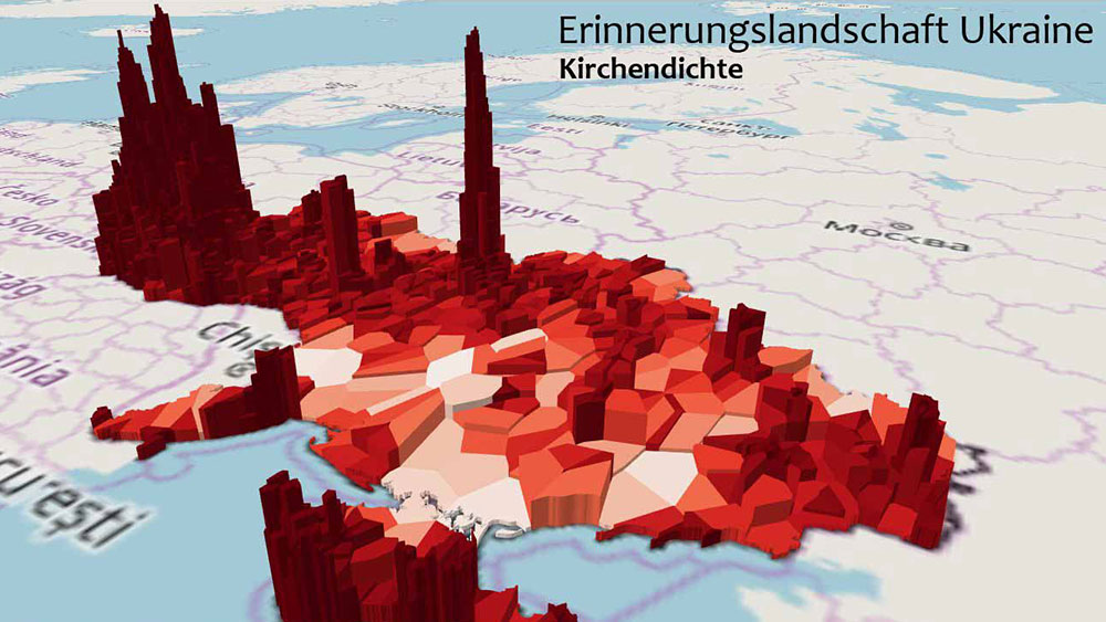
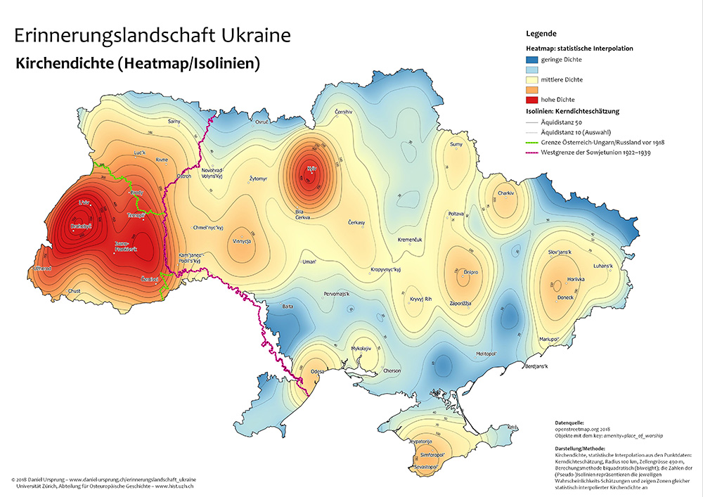
In a previous course, for example, students developed maps of Ukraine. The starting point for these maps was the question as to why the density of sacred buildings was so much higher in Western Ukraine, especially in historical Galicia, than in the rest of the country. Relating this data to a number of other variables brought about interesting correlations: For example, that the election results in Galicia generally differed from other regions in Ukraine. The cartographic representation thus serves as a heuristic tool to infer hypotheses, which can then be verified or rejected through traditional scientific methods.
The reasons for Galicia’s high church density are rooted in the region’s history: In Western Ukraine, the impact of Soviet atheism was far less pronounced. The region had only been part of the Soviet Union from 1939/1945 and was previously shaped by the Habsburg Empire, to which it had belonged. In Ukrainian national circles, traditionally there has been a strong affinity with the church, especially the Ukrainian Greek Catholic Church, which had been forbidden under the Soviet regime. As a result, there was a quick resurgence of churches following the collapse of the Soviet Union, whereas in the industrial regions of the Donbass, where Soviet influence had been stronger, there was a much smaller need for religious representation in the public sphere.
“Visualizing data allows students to quickly grasp several characteristics of an unknown territory,” concludes Ursprung. Especially when it comes to Eastern Europe, it is very important that students get an idea of a space they’re mostly unfamiliar with. The Teaching Fund project ultimately aims to develop a didactic set of maps that critically visualizes key media-specific dimensions of representation in (historical) maps by showing the same topic from different angles. The student’s work is thus both illustrative and documentary.